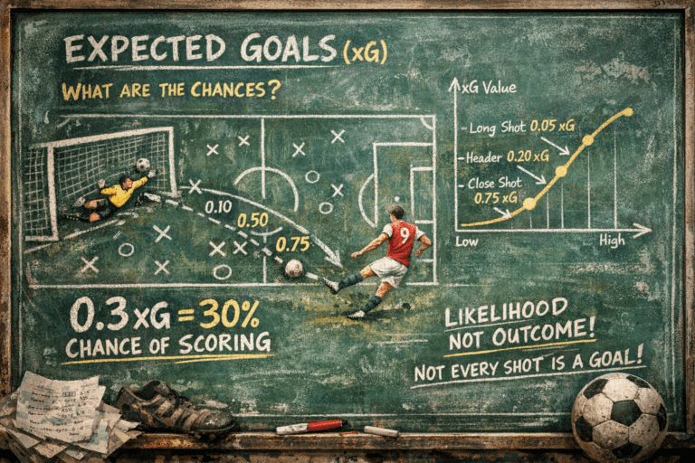
Pass Maps and Heatmaps in Football: What Are They Actually Showing?
You have seen them everywhere. Colourful blobs on a football pitch, networks of lines connecting dots, heat signatures that look like weather maps. Pass maps and heatmaps are now as common in football coverage as formation graphics and possession percentages. But most people who see them have no idea what they are actually showing. This is what those images really mean, and why they matter more than almost any other visual in modern football analysis.
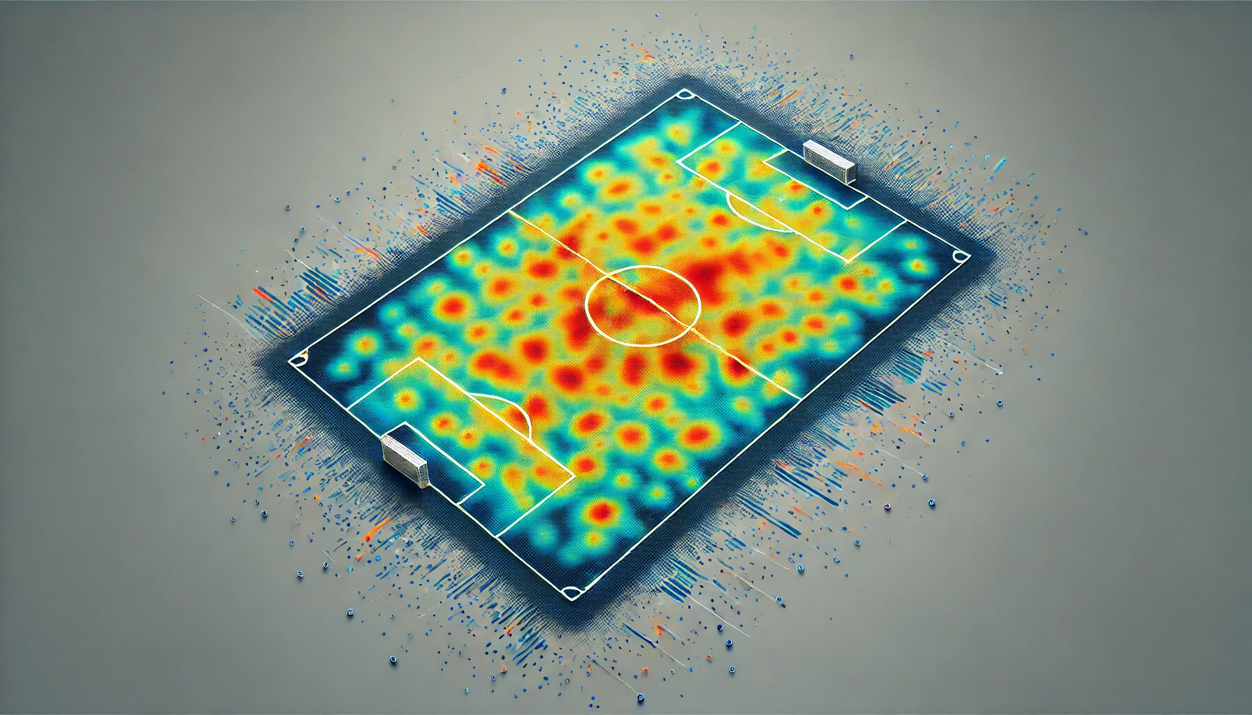
What Is a Heatmap?
A heatmap is a visual representation of where a player or team spent their time on the pitch during a match. The concept is simple: every time a player touches the ball, makes a run, or occupies a particular zone, that action gets recorded as a data point. The pitch is divided into dozens of small zones, and every action in each zone adds to its colour intensity. The more activity in an area, the warmer the colour becomes. Bright red or orange means heavy presence. Cool blue or purple means barely any involvement.
The data behind these maps comes from two main sources. Event data records every time a player actively does something with the ball, a pass, a shot, a dribble, a tackle. Tracking data goes even further, recording the position of every player on the pitch up to 25 times per second, whether they have the ball or not. The combination of both produces heatmaps that capture not just where a player touched the ball but where they moved, where they pressed, where they held their position.
A single glance at a heatmap can tell you things that 90 minutes of watching a match might not make obvious. A striker whose heatmap is concentrated in a narrow central channel is a penalty box poacher. A striker whose heatmap spreads across the full width of the attacking third is a pressing forward who drops deep and wide. Same position, completely different job.
What Is a Pass Map?
While a heatmap shows where, a pass map shows how. Specifically, it shows the connections between players: who passes to whom, how often, and from which areas of the pitch. In a typical pass map, each player is represented by a dot positioned roughly where they spend most of their time on the pitch. Lines connect the dots to show passing relationships, and the thickness of each line represents how many passes were made between those two players. The thicker the line, the stronger the connection.
What makes pass maps so revealing is that they expose the skeleton of a team’s playing style. A team built around short passes through the middle will produce a dense network of thick lines clustered in central areas. A team that plays direct, using long passes to bypass the midfield, will produce a sparse network with thin lines in the centre and thick connections skipping straight from defence to attack. You do not need to know anything about tactics to look at two pass maps side by side and immediately understand which team controls the ball and which team gives it away quickly.
Pass maps also reveal where a team’s most important relationships are. If one particular line is dramatically thicker than all the others, that connection is the beating heart of the team’s build-up play. Remove one of those players through injury or suspension and the whole network changes shape, often in ways that explain a sudden dip in form.
Manchester City: The Most Recognisable Pass Map in Football
No team in the world produces more recognisable pass maps than Pep Guardiola’s Manchester City. Their network is immediately distinctive: a dense web of connections spread evenly across all areas of the pitch, with no single dominant relationship and no obvious weak link. Every player connects with almost every other player with roughly equal frequency. The lines are thick throughout.
This reflects Guardiola’s positional play philosophy, where every player must be comfortable receiving the ball in any situation and passing it to multiple options. The heatmaps that accompany City’s pass maps show players occupying precise zones with extraordinary discipline, the full-backs high and wide, the false nine dropping deep, the number eights arriving late into the box from midfield positions. The visual effect is of a machine: every part moving in coordination, no loose threads anywhere.
When City have an off day, you can often see it in the pass map before you see it in the scoreline. The network becomes lopsided, connections on one side of the pitch become thinner, the usual passing triangles break down. The data captures the messiness before the result confirms it.
Liverpool and the Full-Back Revolution
One of the most fascinating things pass maps revealed over recent years was the transformation of the full-back position. Liverpool under Jurgen Klopp, and now under Arne Slot, produce pass maps where the full-backs are among the most connected players on the pitch, often more so than the central midfielders.
Trent Alexander-Arnold’s pass maps in particular became famous in football analytics circles. His lines ran not just sideways to centre-backs or forward to wingers, but diagonally across the pitch, switching play with pinpoint precision. His heatmap showed him spending time in positions no right-back had traditionally occupied, sometimes almost in central midfield during the build-up phase. The numbers behind the visual confirmed what coaches and analysts were seeing: Alexander-Arnold was not a defender who occasionally attacked. He was a playmaker who occasionally defended.
This is exactly the kind of insight that pass maps deliver. Not just confirming what you already thought you saw, but revealing patterns that are invisible to the naked eye across ninety minutes of football.
Heatmaps That Told a Story: The Famous Examples
Some heatmaps have become famous in their own right because of what they revealed about a particular match or player. After Barcelona lost 8-2 to Bayern Munich in the 2020 Champions League quarter-final, Luis Suarez’s heatmap went viral. The striker had barely touched the ball outside the centre circle, spending most of the match returning for kickoffs after Bayern scored. The map was a perfect visual summary of a humiliation.
A similarly memorable case involved Andre-Frank Zambo Anguissa during a particularly dominant Napoli performance. His heatmap covered almost the entire centre of the pitch, from his own penalty area to the opposition’s, showing the relentless energy of a midfielder who never stopped running. The visual made the case for his performance more powerfully than any statistic alone could have.
Goalkeepers produce some of the most unusual heatmaps. A keeper who plays out from the back, sweeping behind a high defensive line, will have a map that extends well beyond the penalty area. A traditional keeper who stays on the line will have a map concentrated in a tiny box. Two players, same position, completely different profiles.
What Heatmaps Cannot Tell You
For all their power, heatmaps and pass maps have limits that are worth understanding. A heatmap shows where a player was, but not why they were there. A striker with a low-activity heatmap might have been tightly marked and effectively neutralised, or they might have been lazy and disinterested. The visual looks the same in both cases. Context matters, and context requires watching the match.
Pass maps show connections but not quality. A team can have a dense, impressive-looking network of passing connections and still be playing sideways and backwards for ninety minutes without creating a single chance. The map shows volume, not danger. That is why analysts almost always use pass maps alongside other metrics like expected goals, progressive passes, and chance creation to build a complete picture.
There is also the question of opposition influence. A team’s pass map against a deep defensive block looks completely different from their map against a high-pressing opponent. Comparing two pass maps without knowing the context of each match can lead to misleading conclusions. The best analysts always ask: what was the other team doing?
Where to Find These Maps Yourself
The good news is that heatmaps and pass maps are now freely available for almost every professional match in the world. Sofascore and Fotmob both offer player heatmaps on their free apps and websites, updated within minutes of a match finishing. FBref provides detailed passing networks for teams in the major European leagues going back several seasons. Understat offers shot maps and positional data for the top five European leagues.
The next time you watch a match, pull up the heatmap for the player you are most interested in at half-time. Then look again at full-time and notice how it changed. Did the pressing winger suddenly stop covering ground in the second half? Did the holding midfielder stop receiving the ball from the centre-backs? The map will often explain exactly why the result turned out the way it did, and in a way that no amount of commentary can quite capture.
That is the real power of these visuals. Not just showing you data, but making the invisible visible.